Bridgley
THE CLIENT
Bridgely helps facilitate child and initiative sponsorship around the world. But unlike other competitors, the journey doesn’t stop there. Bridgely fosters real relationships by allowing direct communication from community leaders and causes.

This project was completed with Made with Future, a design and development agency. I was the primary product designer for the project and collaborated with project managers, software developers, and the client.
September 2024 - March 2025
The Problem to Solve
Bridgely has a great mission but the app lacked any communication or clear UX flows to help guide the user through the process of joining a community, sponsoring a cause, and getting connected to what the community is all about.

Some questions users may ask upon opening the app
Goal
Our goal was to clean up the app structure to find simpler patterns and clear communication of the app's purpose and function to the user. This aimed to improve user onboarding, increase engagement within communities, and ultimately drive more sponsorships.
Impact
While this release is still in the early days for concrete user metrics, the positive feedback from the client team suggests a significant step towards a more user-friendly experience.
ONE CLIENT PARTNER SAID
“I got a minute to look at the updated UI. I must say, I’m impressed. Everything is carefully and thoughtfully positioned.”

Discovery
To kick off this project, I created a flow diagram of the entire app experience to identify all the pain points and potential gains. This was used to align the team and the client on the current experience.

View Full Flow Chart in FigJam
Key Issues Found
(Screenshots before redesign)
Causes are things that users can sponsor such as children or causes (such as funding clean water, or rebuilding a school). Since the parent and child terms are the same, this causes confusion.
Main bottom nav tabs suddenly appear after the user has sponsored a cause. This unexpected change in main navigation doesn’t give the users a full sense of everything available in the app.
Value proposition for primary use cases aren’t isn’t clearly explain to the user. Call to actions then feel confusing or unnecessary.
Cluttered global (home) tab had no clear purpose and had content that didn’t provide context as to where it was coming from
The ‘sponsor a child’ flow doesn’t flow up with success upon entering credit card information. This could cause frustration and uncertainty to users.
TLDR: The app was riddled with issues that made it difficult for even our internal team to have clear conversations about what was what. Upon working through individual small feature objectives, another designer and I found it challenging to make good UX decisions and, ultimately, these features wouldn’t impact the larger issues.
As a team, we decided that a restructure of the app was the best way to move forward. This would give the developers a chance to clean up the code base, and would give me a chance to clean up the structure of the app and main user flows.
App Restructure Plan
I created two different potential app diagram maps to address the navigation and function issues found in the app.
Option 1


This has a more basic UI structure with 3 bottom tabs each with a specific function. A tab for a feed of all my community posts, a tab for all my communities and sponsorships, and a discovery/search tab.
Option 2


This option was a more unconventional idea where the UI is centered around the communities the user had joined (think discord; where each server has it’s own place and you can switch between them).
After presenting these two options to the internal dev team, we all liked option 2 but felt the idea was too far from what the app was at the time. We decided to move forward with pitching option one to the clients. Our hope was we could move around most of the existing screens to simplify the navigation instead of taking on a more complex redesign.
While the client liked the larger idea of cleaning up and making the navigation smoother, they had some specific pieces of feedback that sent me back to the drawing board for a few iterations:
They felt the users would lose connection to a larger global community
The updates tab loses the focus on being a part of a specific community. It felt too much like facebook and the page may not have new updates very frequently.
Personas
The client, then, shared five personas that they identity for the app. These personas helped guide my next design decisions because they help to define the main jobs to done of the app as well as the main product goals for the app.
Each of these 5 personas has a very different user goal and jobs to be done. While all 5 are important to consider, upon further analysis, I identified 2 main personas to focus on creating perfect experiences for. All other personas would be considered but their specific use cases weren’t the highest priority for the app.

Sally Sponsor
is the donor who is empowered to:
Connect and communicate with new communities
Donate Funds
Understand the impact of those funds
Communicate with Frontline ministry leaders
Share causes she cares about to her network

Felicia Facilitator
is a frontline program coordinator who is empowered to:
Lives and works in the schools and communities needing support
May have low data
May or may not speak English
Have access to a global stage where she can share her story and ministry updates
Connect directly with supporters
Create funding requests
These two personas are like two sides of a market. One who is requesting funds, and the other who is donating funds. Both need to be able to connect and communicate with each other in order to form deeper connections to these causes.
Design Iterations
The next step was launching into several rounds of iteration, design exploration, and client feedback. I worked on all areas of the app including admin tooling, onboarding, sponsoring and more in order to bring the client’s vision and direction to life. Instead of walking through everything, here I’ll focus on the two main areas of the app: discovering communities and connecting to my communities.
Discovering Communities
The goal was to make the discover tab have a more global feel to increase awareness about different communities to support.

I added more filtering such as country tags, and community types to help Sally Sponsor users understand where these communities around the world and what type of causes they could support.

This area of the app was Felicia Facilitator's global stage. Community Facilitators now had a place for their posts to be shown to the public instead of the global feed being cluttered with all posts.

Instead of a single list of communities, I added categories and sections to encourage users to scroll and find new communities that they may be interested in supporting.
The client was very excited about this update! They loved the country flags at the top and the overall feel of the UI. They were excited about the potential increase in visibility of more communities, which in turn could lead to a broader range of sponsorships.
My Community
The goal was to elevate individual joined communities and help sponsors take action to support

To address the lack of community focus in the updates tab, I explored adding community-specific filters.
However, clients still felt the updates feed, even with filters, didn't effectively drive the core business goal of facilitating sponsorships and fostering close connections to specific communities.
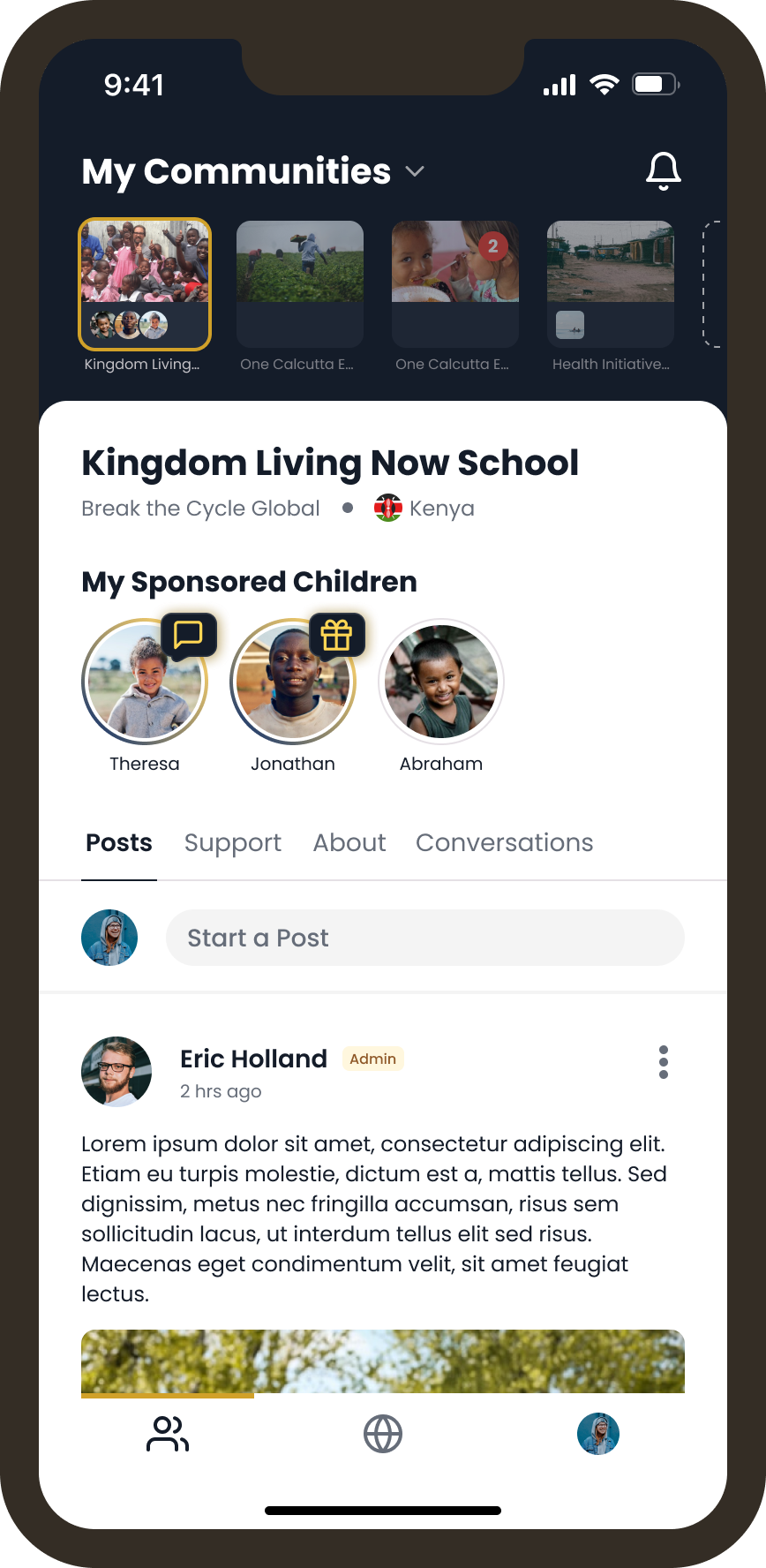
I decided to fully scrap the updates feed and shape the page to be centered around the user’s communities.
Each community gets its own page/tab.
My sponsored causes live here or this section becomes a call to action to sponsor a child/initiative if the user hasn’t sponsored anything
Posts and all other content for the community live in these tabs, like the current app.
The updated design offers a more direct route for users to connect with and support specific causes, which better aligns the user experience with Bridgely's business goals.
The client loved this new iteration! This final iteration allowed them to go all in on this full app update and were very eager to get these new designs into the app as quickly as possible.
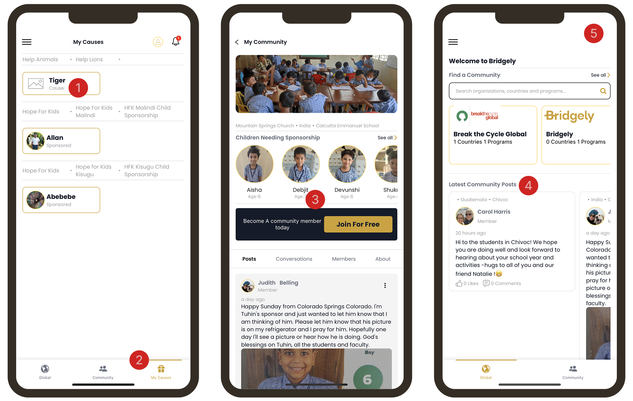
Final Designs
Today, the full redesign is live in the app. The client is excited to see how their users reacted to these major improvements.
Some of the Final Screens
